Why this matters
The dashboard is the first thing you see when the app opens. Favourite devices, groups and scenes can be put there, so the things used every day are one tap away.
Favourites and rooms
Two ways of organising the same devices, and they answer different questions.
Rooms are where things are. Every device belongs to exactly one, and the room view is how you find something you rarely touch.
Favourites are what gets used. Devices, groups and scenes can all be pinned to the home screen regardless of which room they are in.
The rule that makes this work: pin what is used daily, leave the rest in rooms. A summer house with eighteen devices might have four favourites — the outdoor lighting group, the heating, the water, and an “away” scene. Everything else is two taps away and does not need to be one.
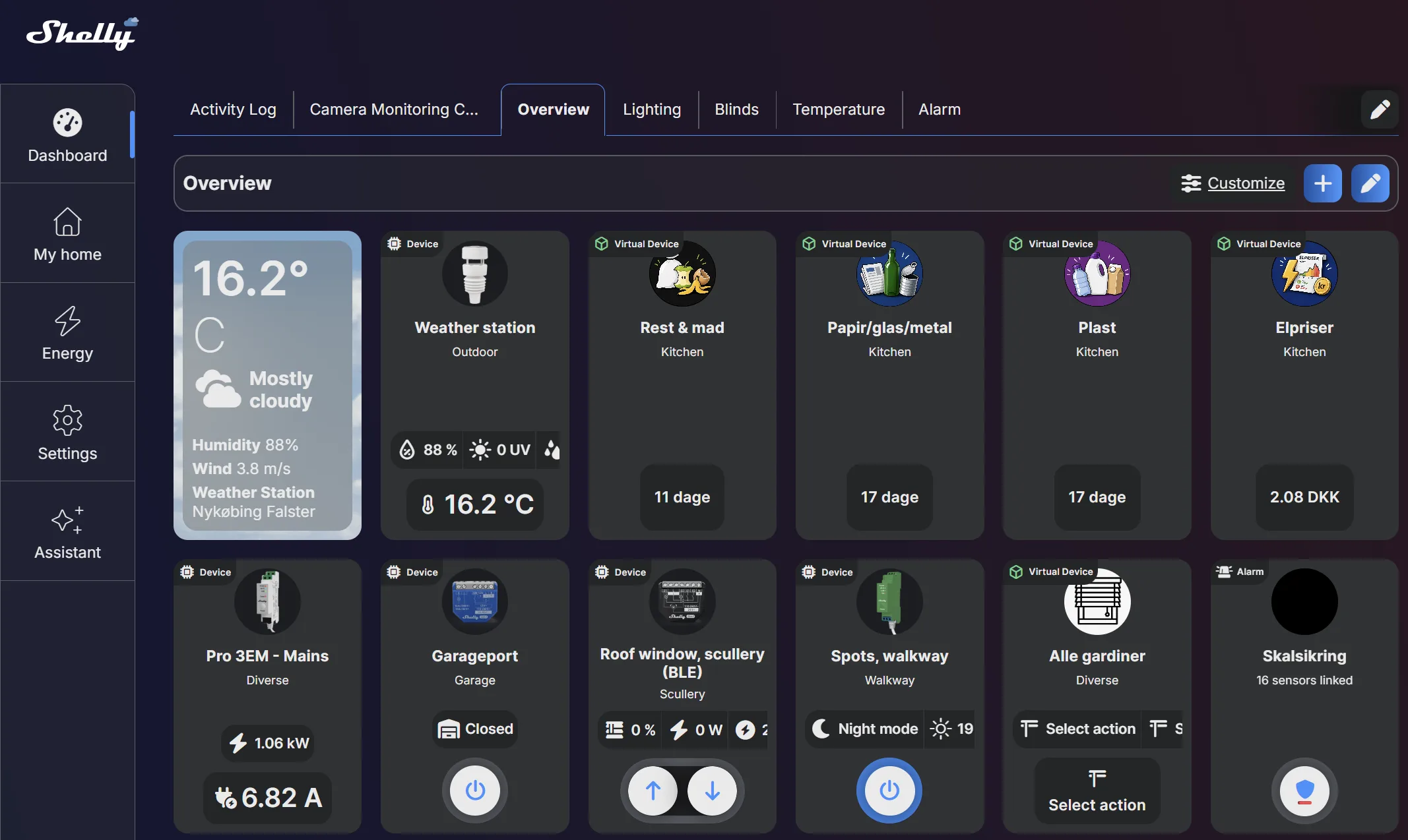
Order matters too. What sits at the top gets used; what needs scrolling does not. Put the most-used item first, not the most impressive one.
Device cards
Each device appears as a card, and one setting decides how much it tells you.
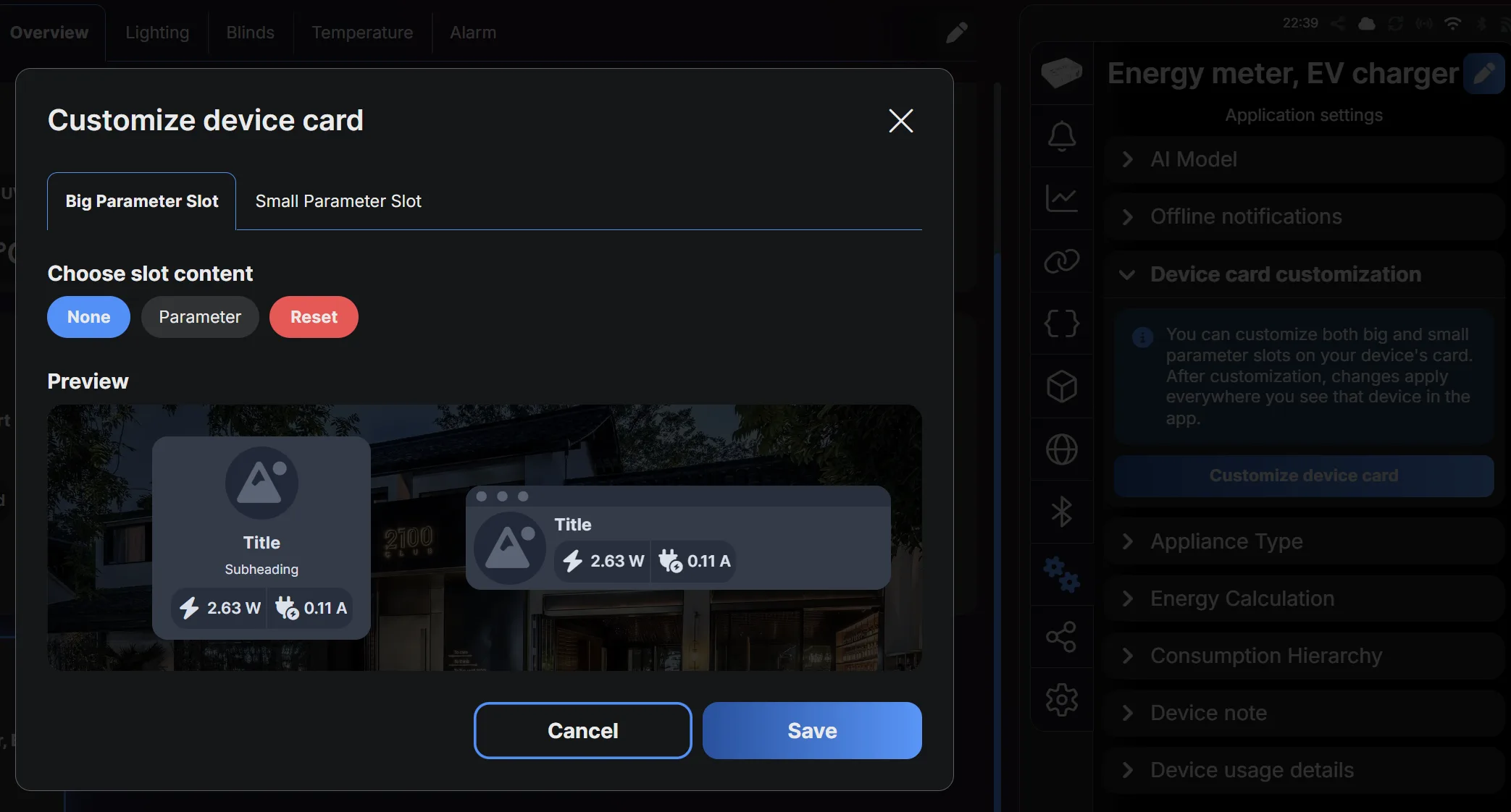
Card customisation. Devices carry a Device card customization setting that changes what the card shows. On a metering device this is where you decide whether the customer sees power draw on the front, or just an on/off control.
Show power on the things where it teaches something — a heat pump, a water heater, a car charger. Hide it on a light, where a wattage next to a switch is noise.
Widgets
Beyond device cards, the home screen can carry widgets — a consumption summary, weather, or a virtual component showing any value a script produces.
The consumption widget is the one worth adding on almost every installation with metering. It turns “the house is using 400 W” into something the customer sees without going looking, and that visibility is what changes behaviour. See energy dashboard.
A virtual component widget is how a scripted value reaches the home screen. The electricity price from live electricity prices appears this way — a number the app knows nothing about, shown as if it were built in.
The web app
control.shelly.cloud is the same account and the same devices in a browser. The layout differs because the screen does: more devices fit at once, and editing several is faster with a keyboard.
Use the browser for setup and the app for daily use. Naming twenty devices, building scenes and checking firmware across an installation are all faster on a computer — and none of them are things the customer will do.
Before handing over
A short list that turns a working installation into a finished one:
- Every device named after its load, not its model
- Every device in the right room
- The four or five things used daily pinned as favourites, in the order they are used
- Groups created for anything the customer will want as one button — see grouping
- Consumption shown on the loads where it teaches something, hidden where it does not
- Scenes named so the customer understands them — they will eventually fight anything they cannot identify
Then hand the phone to the customer and ask them to turn on the kitchen light. If they hesitate, the dashboard is not done.
Video tutorial
Laying out the dashboard, and what can be put on it.
Loads YouTube when you press play. Watch on YouTube
By ShellyGuide on YouTube